How to Create a Branded Mobile App for Your Restaurant (That Earns 85% More Repeat Orders)
Mobile apps can boost restaurant repeat orders by 85% and save thousands on third-party fees. We'll show you how to build an app that increases sales and enhances customer loyalty.
Key takeaways
- Mobile apps boost repeat orders by 85% by reducing third-party fees and offering a better customer experience with features like fast ordering and easy access to favorites.
- Building a mobile app for Ottavio's Italian Restaurant led to over 50% of online orders coming through the app and increased monthly sales to $24,000 within a year.
- Restaurants can develop apps through a development agency, mobile app builder, or ready-made solution, each offering unique benefits and challenges.
“There’s just no way!”
That's what I used to think when people would ask me if mobile apps work for independent restaurants. Customers won't download an app that’s not from a big chain. Right?
But, I trust our customers. So when my friend Antoinette from Ottavio’s Italian Restaurant said, “Adam, we need an app,” my ears perked up.
It turned out Antoinette wanted a mobile app because her regulars were asking for one. So I built her one. I figured, hey, I’ll learn something. I really didn’t think it would go anywhere.
But then… I couldn’t believe the results.
In less than a month, over 50% of Ottavio’s online orders came through its mobile app. Within a year, sales grew to $24,000 per month. And since customers were ordering directly, Ottavio’s didn’t pay commissions to third-party platforms.
Does your restaurant really need a mobile app?
A lot of the restaurant owners I talk to are skeptical of mobile apps.
As CEO of Owner, I’ve seen the sales data from thousands of restaurants. And I’m convinced that, today, every local restaurant needs a mobile app.
So in this post, we’ll go over the primary ways to get your mobile app built. And I’ll share the six proven features you need to drive more sales. I recommend these features based on the order data I’ve seen at Owner.
Ready to do this? Let’s get started.
3 reasons why every restaurant needs a mobile app
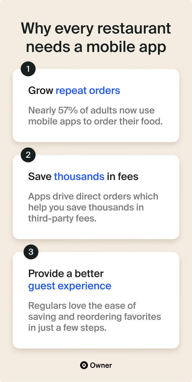
1. Apps increase repeat orders by 85%
Mobile apps are a must for restaurants that rely on their regulars. Think of fast casual, quick serve, and takeout-heavy concepts.
I’ve seen the data behind thousands of restaurant mobile apps. For the right cuisine, they’re proven to increase reorder rates:
Restaurants with apps get 85% more return customers than restaurants without an app. What’s more, regulars who use a restaurant’s app order twice as much as non-app customers.
And when you factor in loyalty programs? Regulars that join your app’s rewards program order 17% more often. Which can make apps hugely profitable.
2. Apps save you thousands of dollars in commissions
With a mobile app, you’ll get your regulars—your most valuable customers—to order directly from you. That means you’re also saving thousands of dollars in commissions from third-party platforms.
Remember, regulars also deal with extra fees from DoorDash, like delivery charges. They pay these fees because they value convenience and are used to apps charging extra. But they’d rather get convenience and pay less. If they spent less in fees, they’d order more often.
Good news: Regulars avoid all of those fees by ordering directly from your mobile app. And they get the same convenient experience they’re used to. Inside your app, you can even remind them just how much they’re saving by ordering from you directly.
3. Apps are a flat-out better experience for regulars
So far, I’ve focused on our perspective as restaurant owners. Of course, it’s all about our guests' experience. Guests keep us in business; mobile apps would be no good if guests didn’t love them.
Fortunately, they do! At least when they’re designed correctly.
Apps are a great part of your mobile marketing strategy when they follow proven best practices:
- Fast ordering. Regulars use apps to place orders in less than 30 seconds, at any time, from their phone.
- Instant access to favorites. Apps are great for guests who want to save and instantly reorder their favorite items.
- Accelerated checkout. Guests want to check out in seconds with pre-saved payment details and tools like Apple Pay.
Later in this guide, I’ll share each of the must-have features that get guests to reorder from your app again and again.
How to make a mobile app for your restaurant (3 options)
So, how should you make your mobile app?
You have three options:
- Hire a development agency: Outsource to get a mobile app built from scratch.
- Create one with a mobile app builder: A “do-it-yourself” approach to mobile apps.
- Use a “ready made” mobile app: Get access to best practices out of the box.
Let’s go into the pros and cons of each of these options.
1. Hire a development agency
Working with a mobile app agency gives you a ton of control. You can design the exact app you want. However, it’ll cost you. I’ve seen ballpark figures starting in the range of $10,000 to $30,000.
Still, this option can be worth it. Especially if you need custom features other tools can’t offer. There are three cases where I see that happen:
- You’re ready to scale. Bigger brands need apps that can grow with them. Sweetgreen invested big in its mobile app back in 2013—now it has more than a million users.
- You need unique features. Custom back-end systems? Specific integrations? A custom app can fit all of your technical needs, too. Not just the look and feel you want.
- You want high-end design. Let’s say you want a premium app design that mirrors your upscale brand. This is far easier to accomplish with a custom build.
One last thing: You have final say over an agency’s work. But, you’re probably not an app developer. So it can be tough to know if the code or UX of the app is good. I’ve seen many restaurant apps with poor reviews (e.g., “glitchy,” “confusing”) that were probably a result of this mismatch.
Estimated cost: Starting at $10,000+ total
Estimated timeline: Likely a few months
2. Create one with a mobile app builder
No-code tools like Bubble and Glide have made it possible to build apps without a developer. No code, and almost no cost; many of these tools also run pretty cheap. So if you’re a little cash-strapped, mobile app builders are a budget-friendly option.
They’re like a blank canvas. Most things you can imagine, you can create. Once you get familiar with these tools, you can test new app features quickly. And if you have that one unique feature you need, they’re much less expensive than a custom build. I’ve even heard some restaurant owners start with a no-code tool to “prototype” the app they want before committing to a full custom app.
However, no-code builders often don’t come with key features that restaurant apps need. So you’ll likely need to build or integrate things like online ordering and loyalty programs. Or rely on another product to offer them in your app.
Estimated cost: $100–$300 per month
Estimated timeline: It’s hard to say; you set the pace
3. Use a “ready-made” mobile app
Platforms like Owner.com build you a ready-made restaurant website and mobile app that work together. One advantage of our tool is you get an app designed specifically for restaurants, not something generic. And your app design is based on proven best practices.
Owner costs a flat monthly subscription fee. So one disadvantage of our product is that it’s not a one-time cost. But we charge a subscription so we can continue to invest in our product. We test and improve things about our mobile apps all the time. Recently, we created a new checkout that converts much better. Now, every Owner app has access to that new checkout.
Because we use order data to design our apps, we also have limited customization. We want you to showcase your brand with your logo, color palette, menu photos, and copy. But we don’t allow changes to the app’s overall design. That’s to ensure your app keeps its high conversion rate.
Estimated cost: $300—$600 per month
Estimated timeline: With Owner, you can get set up in days/weeks
Choosing the right approach
No one solution has it all. You’ll likely have to compromise somewhere: with cost, flexibility, or out-of-the-box features.
Whatever option you choose, I want to make sure your app drives the most direct orders possible. So now I’ll share the proven best practices I’ve seen work in restaurant mobile apps. The features that drive more orders—all based on the data I see on Owner’s platform.
You can ask your developer to include these features. Or build them yourself in a no-code tool. Just make sure to consider them for your next app.
The 6 must-have features of restaurant mobile apps
It's time to admit a nerdy secret of mine: I’m obsessed with analyzing the mobile apps from top restaurant brands. I should probably get a real hobby! But I find it so fascinating.
National chains have spent millions of dollars building their apps. They have thousands of developers working on them. Top apps like the Starbucks app have been around for more than 15 years. So we can study what's worked for them.
I collect all of the best practices that billion-dollar brands use. Then my team and I test those best practices in Owner. It’s how I’ve learned what really works for mobile apps.
After analyzing the data, I’ve found six must-have features for restaurant mobile apps.
Features that dramatically increase your sales and reorder rates. Must-have features that are useful in every app, whether you’re using a service like Owner or hiring a developer. Let’s have a look. 👇
Must-have #1: No-hassle sign-up experience
No matter how convenient your app is for guests, you’re still asking for a big favor. You want your app to appear on their phone screen. That’s precious real estate.
If you’ve gotten a guest to download your app, you’re almost home. Let’s not trip at the finish line. Here’s how to ensure your app’s sign-up experience doesn’t stop guests in their tracks.
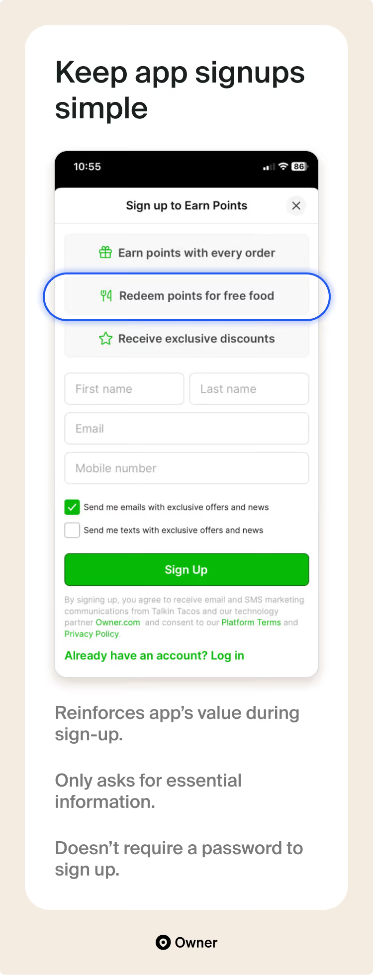
Ask only for essential details upfront
One mistake even big chains make is asking for too much information upfront. A customer shouldn’t need to fill out 12 forms to check out of your app.
So make sign-up easy! Do that by letting customers create accounts in seconds. Without a password, ideally. And only ask for essential details—the stuff that makes it easier to serve customers and reach them later. Like their phone and email.
If you need additional info, ask later. For example, we can ask guests to share payment details at checkout. Guests are more motivated to fill that information out once they have an order they want to place.
Selling in multiple places? Let customers choose a location first.
Confession: I even study negative app reviews from major brands. Some of the most common complaints I see are about multi-location ordering. Guests get frustrated after they fill up their cart only to find out a certain location doesn’t have that menu option.
Choosing a location is one decision you should put upfront.
This is why every Owner app we build for multi-location restaurants asks guests to confirm a location before they browse the menu. This way, guests know that any order they place can be fulfilled.
✅ Case study: KFC
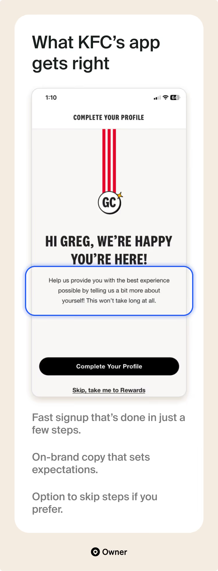
KFC’s sign-up is one of my current favorites. It goes the extra mile with its copy, design, and options. Screens that ask for details do so in a motivating way that focuses on the benefits. Check out the last line: “This won’t take long.” The emphasis is always on speed.
Better still, KFC lets me skip steps if I want to jump straight to ordering. But it always ensures to ask my location before I start adding things to my bag.
Must-have #2: Fast and easy online ordering
Saying you should have smooth online ordering is “eat your vegetables” advice. Everybody knows it! But far fewer people go into detail about what that actually means inside a mobile app.
Today, I’m going to show you. Here are the secrets to a best-in-class mobile ordering experience.
Make orders possible on every screen
The most valuable thing guests do in your app is place orders. So placing orders should also be the easiest thing to do.
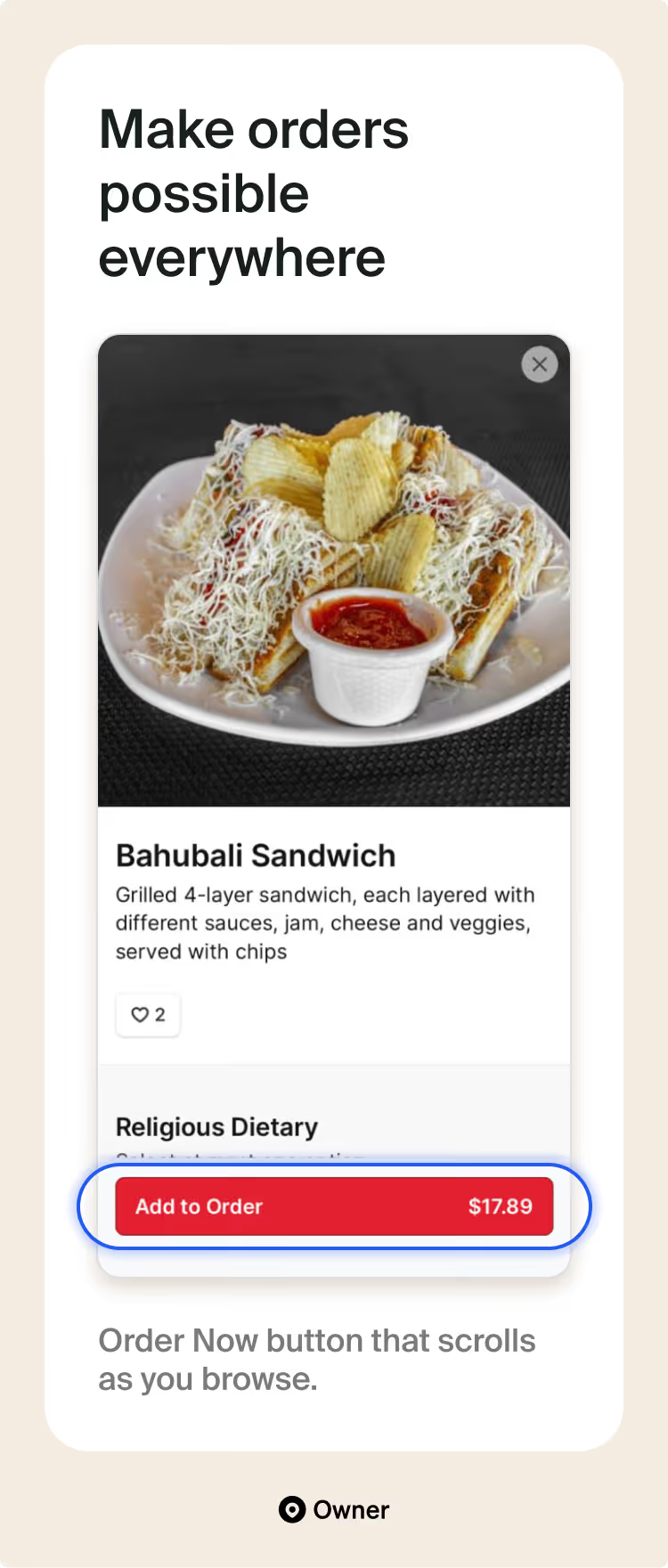
That’s why I highly recommend using a floating Add to Order button that appears on menu listings. Great menu listings give guests reasons to order as they scroll. Here’s how appetizing this dish looks, here’s how we make it, and so on.
There’s another small detail: The item’s price is listed right on the button. That way, guests won’t hesitate wondering what the price is. Or run into any unpleasant surprises once they reach checkout.
Default to Apple & Google Pay
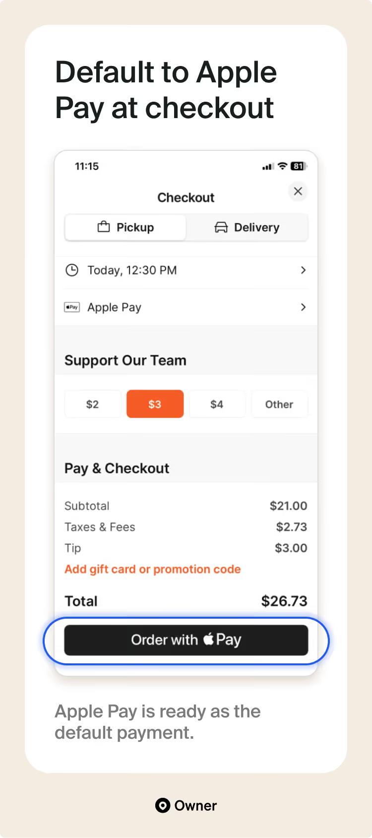
When services like Apple Pay are active on a customer’s phone, then the customer doesn’t fill out anything to place an order.
I placed an order with the Owner customer above instantly. No forms! All because their mobile app recognized my Apple Pay. Think of these payment options as “smart checkouts” that convert better.
Of course, you should also offer the option to change their preferred payment method if they need to. And when customers add or change their payment method, your app should let them save their information. This is a hundred times more convenient than having to re-enter a credit card.
All roads should lead to checkout
Once you have a fast checkout in place, it’s best to address the final snag. You’ll lose orders whenever a customer can’t place an order now.
I’ve seen too many mobile apps forget this. These apps essentially stop working during off hours. Or they say a guest can’t finish an order if delivery isn’t possible—even if takeout is fine. This is a big mistake.
A customer should always be able to check out. Right then and there. Not open? Let customers order and choose a time. Can’t deliver? Make it possible to select takeout instead. Let guests self-serve on all of these options right inside the app, and you’ll never lose an order again.
💡 Tip from Adam: This is where it really makes sense to have your app built by a platform like Owner. Orders on Owner mobile apps can be sent to customers at the specified time by a third-party delivery team we provide for a flat fee. So every scheduled order on your app can be fulfilled—with no involvement from you.
Let customers save and reorder in one tap
Regulars are quick to get into a routine. Especially for foods they reorder often. Think about it: Your favorite coffee, your favorite sandwich spot—you probably have a go-to order.
So let’s make reordering those go-to’s easier. Add a feature in your app that acts as a “Likes” or “Favorites” option. Make sure it appears on all your menu items. When guests tap it, this feature should save the selected item to their favorites. That way, they can find these dishes quickly.
Ideally, the “Like” button takes a single tap. That’s what we’re used to in other food apps. Making this action super fast also lets regulars use this feature as a bookmark. They’ll use it to save dishes that caught their eye and that they want to try in the future.
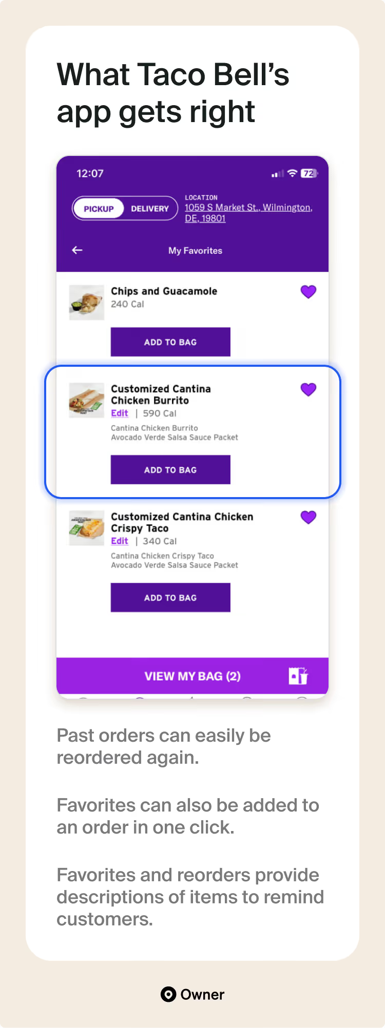
✅ Case study: Taco Bell
Taco Bell does a great job of letting you add favorites at any time, from (almost) any screen. You can even do this before you create your account—and your favorites will carry over once your account is set up. Nicely done.
Here’s something else I like: You can move items from your favorites to your bag (i.e., your cart) in a single tap. This is great for regulars who like to mix and match their go-to items, but who don’t want to order the exact same thing again and again.
Must-have #3: Simple (but powerful) in-app rewards
Mobile apps and loyalty programs are like PB&J. First, loyalty programs are a great incentive for regulars to download your app.
But the bigger payoff is that mobile apps are already home to your best customers. With that in mind, here are the most effective ways I know to make rewards programs work in your app:
Make reward progress visible to customers
Rewards work because they “gamify” the act of reordering. This is really just a marketing term that means a clear goal and visible progress make things easier to complete.
Restaurant loyalty programs give guests both clear goals and visible progress. Just make sure you take that second one literally! I’ve found that guests are much more motivated to hit milestones when it’s easy to visually see how close they are to their next reward.
💡 Tip from Adam: I highly recommend starting guests off with a few reward points so they don’t see a big “0.” That’s demotivating. Studies on the “endowed progress effect” also show us that people are much more likely to finish something if given a head start. Guests feel like they’re wasting gifted points if they don’t at least hit the first reward.
Reinforce your rewards everywhere in your app
The other time you want to remind guests of their rewards progress is when they’re ordering. Knowing you have “50 points left” until a free mac and cheese is great. But knowing your favorite sandwich will definitely earn you enough points for that reward is even better.
I recommend reminding guests of rewards in these two ways:
- “Next reward” banner. On individual menu items, show guests how much closer this order will get them to their next reward. For example, show how their favorite bacon cheeseburger will move them closer toward that free shake.
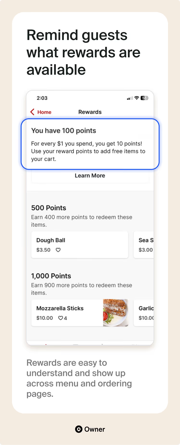
- Rewards overview page. Add a page explaining how rewards work. On this page, tell guests how many points they have left to go for each reward tier. Above, you can see how Owner customer Pizzeria Mariana explains their program and previews rewards.
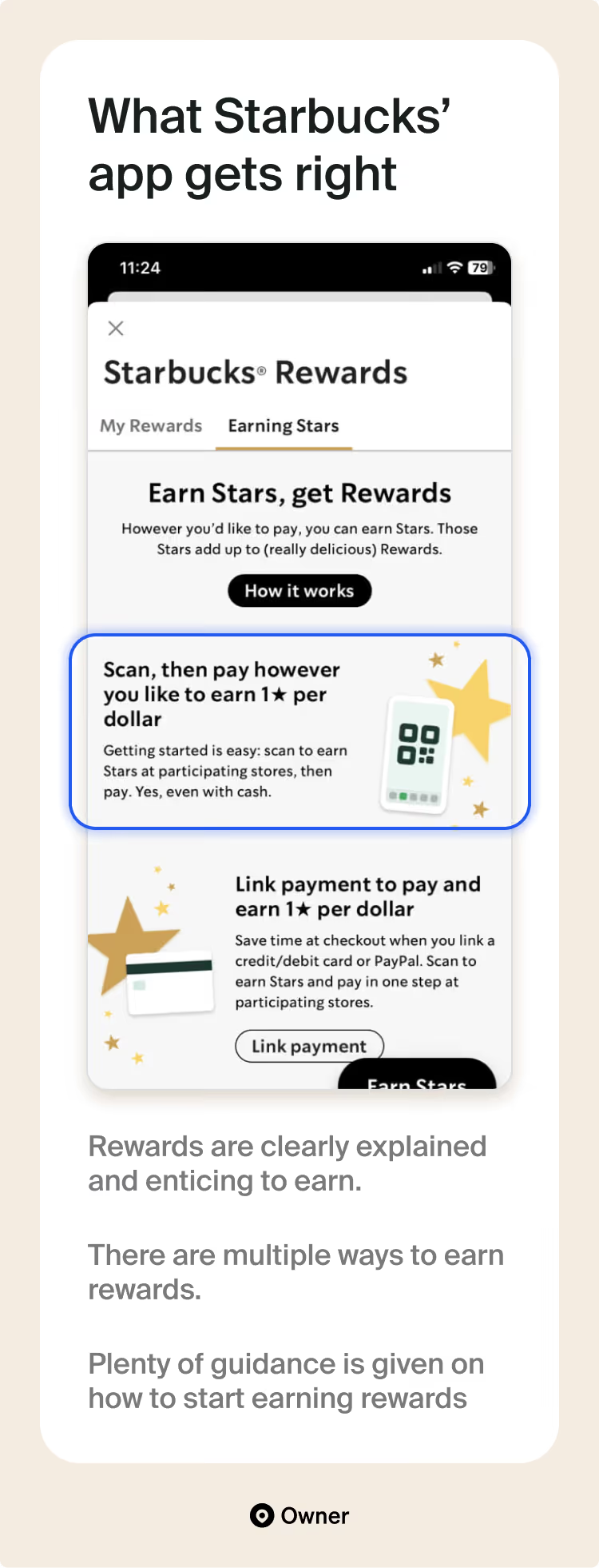
✅ Case study: Starbucks
Starbucks earns 59% of its revenue from its rewards program. All things considered, Starbucks might have the best-performing rewards program ever.
The genius is in its star system and how they influence every part of the rewards program. Mostly by getting guests to do things for stars that are profitable for Starbucks. Here are a few I noticed:
- Members actually get more stars for ordering via the app versus online. This is a great incentive, since we know app users reorder more often.
- “Double-star days” reward guests with more points for ordering on certain days. I’m almost certain these days are slow days—and the extra points try to make up for that.
- Special items are also on rotation for additional star points. Again, Starbucks probably picks these items based on margins or to get rid of excess inventory.
Must-have #4: Mouth-watering menu that’s easy to browse
The number one rule of great menus: Guests eat with their eyes. Restaurant owners get this. So they invest in great photos and written descriptions for their paper menus. And even on their website.
Maybe it’s the smaller screens, but I see people forget that this rule applies here, too. Let’s not make that mistake. Here’s my best advice for creating amazing-looking menus inside your app.
Use rich photography and descriptions
I’m always impressed with how creative Owner customers are with their food photography. The example above is a brilliant overhead shot and description from my friend Timirie, founder of Doo-Dah Diner. It’s a perfect blend of style and substance.
And let’s not overlook the description. Menu descriptions are like a tightrope walk. You want to share the key facts of the dish, but you also need to spark a guest’s imagination. I like to do this with two groups of adjectives:
- How it’s prepared: Grilled, poached, marinated, encrusted, shredded, etc.
- Flavors and senses: Sweet, tart, rich, flaky, smoky, etc.
Timirie whets guests’ appetites with strong adjectives—”crispy,” “thick,” “your way.” She’s also able to fully describe what’s in the dish so you know if it’s right for you.
💡 Tip from Adam: Modern phone cameras can take great photos. However, I do feel pro photography is one of the best uses of outside help to improve your restaurant. Great quality photos can pay you back for years—so they’re usually worth the cost.
Give suggestions with popular items
Even regulars don’t always know where to start with their next order. They might have loved your ahi tuna salad, but not be in the mood for it today.
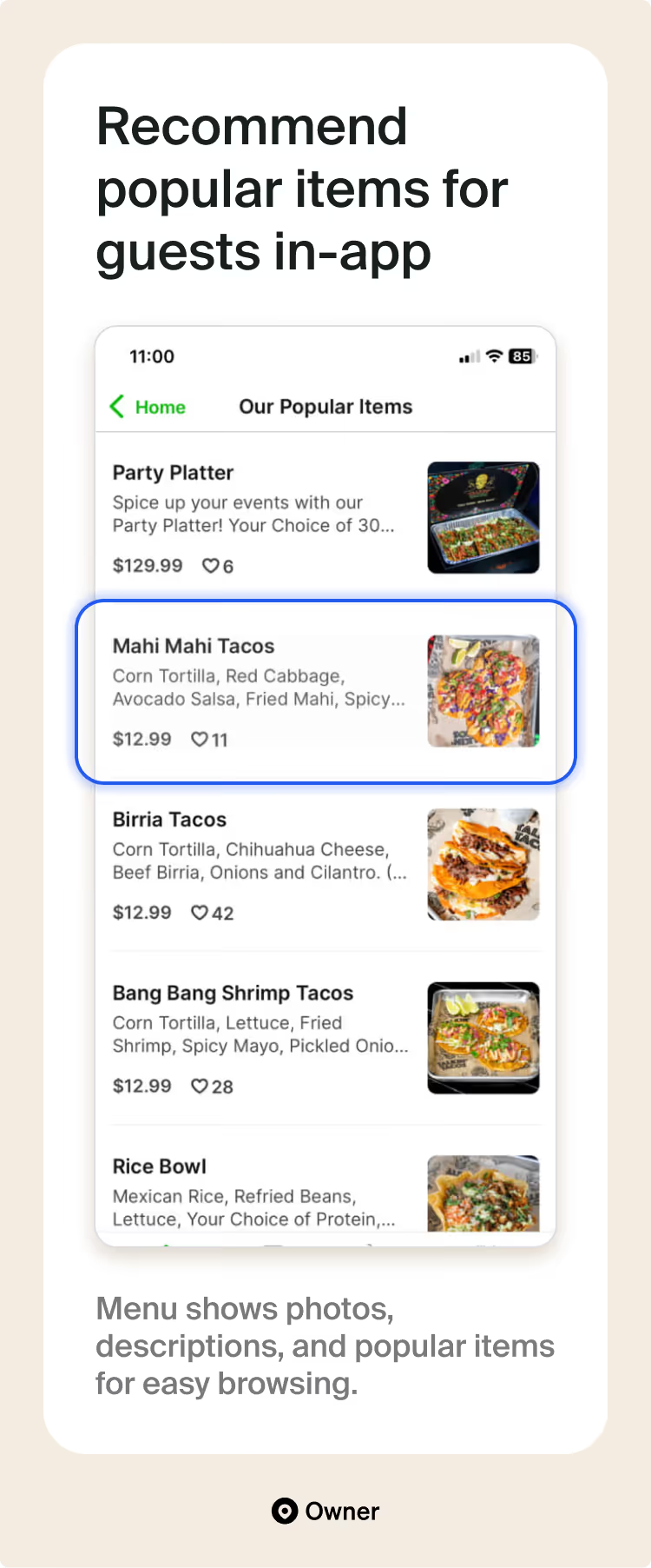
So you should make the menu in your mobile app easy to browse. Use pictures and short but informative descriptions for each menu item. You can also take it a step further with a “popular items” section that highlights fan favorites from across your menu. You can choose these however you like:
- Items that get people in the door
- High-margin items that increase profitability
- Items with especially high reorder rates
The example above from Talkin’ Tacos is perfect. Before making a decision on what I want, I’m greeted with popular dishes. Every dish has excellent photography and social proof. This shortlist also highlights the best and most enjoyed items on the Talkin’ Tacos menu.
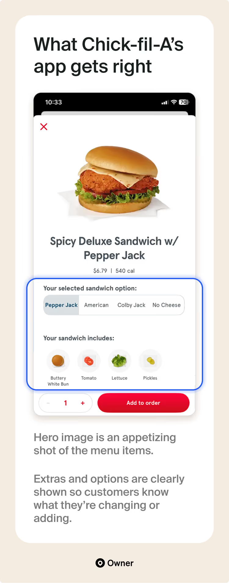
✅ Case study: Chick-fil-A
Here’s an interesting example. Something I haven’t seen in many restaurant mobile apps is the number of photos Chick-fil-A includes for variations and additions. Every addition on every menu item comes with a photo—from the type of bun down to the lettuce.
Chick-fil-A likely sees many guests swapping extras and condiments. Its cuisine definitely invites this. So it took extra effort making this part of the ordering process easy. Its app matches how its customers like to order.
Must-have #5: Smart upsells built right into the app
Entrees typically carry high food costs. Owners know the real money is made through high-margin items like appetizers, beverages, and desserts.
That’s a universal principle that doesn’t vanish in your mobile app. So we also need to figure out how to upsell high-margin items without the ability to recommend them to guests in person. Here are two smart and non-intrusive ways to do that.
Recommend complementary dishes on key screens
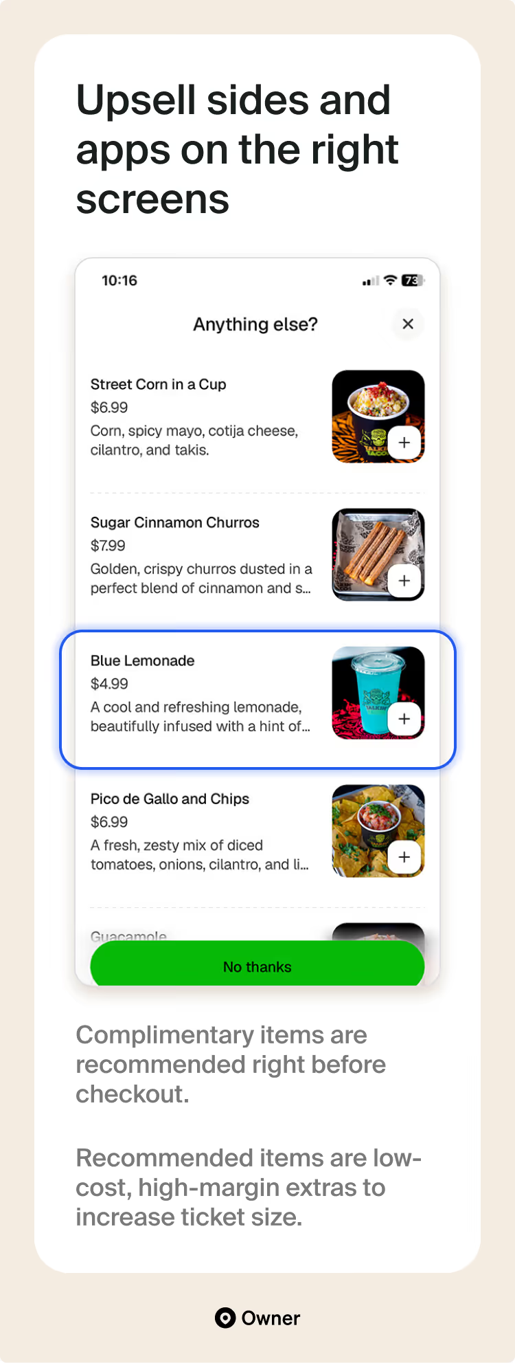
What’s a burger without fries? A meal with slim margins! Sides and drinks are almost pure profit. So when we pair them with higher-ticket menu items, we improve the profitability of the entire meal.
The best time to suggest upsells is when a guest has already picked something out. And there are three places I see “Recommended for you” calls to action perform well:
- In a user’s cart. Guests often check their cart before checking out. This is a great time to suggest “one more thing” to complete their order. Above, we see Talkin’ Tacos recommending high-margin drinks and sides as add-ons for its meat-based dishes.
- Right at checkout. The last chance to suggest items. Since a customer is so close to purchase, it’s best if you make recommended items “one tap” at checkout. As in, a customer can add them to their bag in just one tap on mobile.
- After adding an item. Is it smart to suggest items after a guest adds something to their bag? Yes, but be careful that the pop-up you display doesn’t get annoying. You may not want it displayed every time a guest adds something.
Clearly price your order additions and modifications
Additions and modifications are a great way to increase order size. Especially for main entrees. You’re really just letting a guest customize their order and earning more for doing so.
Above, we see Samos Oaxaca offering guests the ability to customize their burrito with multiple protein options. This is smart. I’ve seen restaurants offer this option but not advertise it in their mobile app. That means many regulars never knew they had the option to upgrade their order.
These are some of the more profitable customizations to offer:
- Basic extras and additions (e.g., extra cheese)
- Premium ingredients (e.g., avocado)
- Dietary modifications (e.g., gluten-free crust)
- Pricier sides (e.g., coleslaw → mac & cheese)
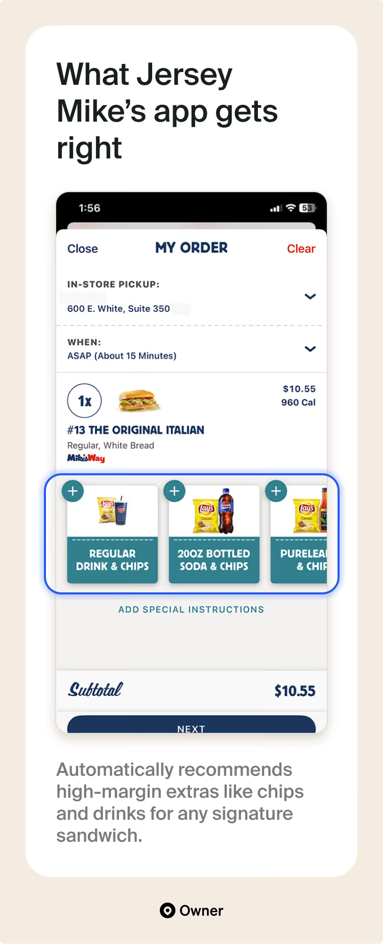
✅ Case study: Jersey Mike’s
Jersey Mike’s nails it with an excellent upsell design. It’s clear what you can add to your order. Notice what’s being suggested—high-margin items. But I also really liked how personalized the suggestions were. Recommended items change based on what you have in your cart.
Best of all, these were truly “one tap” upsells. Hit the plus button and you’re done. That’s what happens on this checkout page. But it also happens on the item page and cart overview pages. Well done.
Bonus must-have: Ability to showcase your unique brand
Third-party delivery apps are known for their “me too” appearance. They want every restaurant listing to look the same. But this is your app. You want it to reflect your restaurant’s unique brand.
But, you also don’t want to over-design your app. Simple is good. So here’s a quick bonus tip on bringing your brand to life without interfering with guests’ ordering experience.
Bring your brand to life with visuals and copy
The first place I always start is with words and visuals. I love how Owner customers make their apps stand out with hero photos, strong color palettes, and exceptional photography.
Remember, your brand mostly comes down to what you sell, what you say, and how you serve guests. Guests don’t expect your mobile app to look flashy like Instagram. So even a no-frills app with great photography and descriptions can work.
Talkin’ Tacos infused its brand into its app with a single photo from its flagship location. It carries it the rest of the way with a show-stopper of a menu.
✅ Case study: Taco Bell
As we’ve covered, visuals and copy are the main building blocks for your brand. And I felt that Taco Bell scored highest across almost all of these marks.
Here’s what I personally liked:
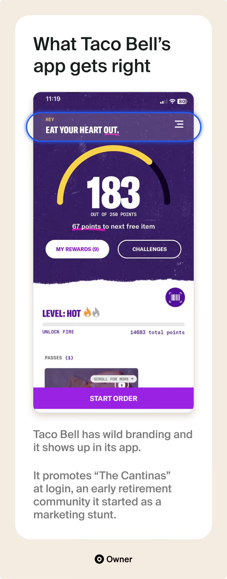
- Consistent voice and tone. Taco Bell sticks with a funny and snarky tone that shows up across its app. It also has clear themes that tie its copy together. Above, you can see the “heat” theme in its rewards program, which ties back to its hot sauces.
- Clear themes that tie together. Look closer at that copy. Taco Bell also smartly includes themes that bring parts of its app together. Above, you can see the “heat” theme in its rewards program, which ties back to its hot sauces and other spicy cuisine.
- One-of-a-kind experiences. And hey, a global brand can afford a stunt or two. I was amazed to see Taco Bell promoting its “retirement community,” a huge marketing stunt it’s running, right inside its app.
Every restaurant needs a mobile app
Hopefully, by now I’ve convinced you how valuable custom mobile apps are for restaurants with high reorder rates. Wait, scratch that. I hope the data and evidence have convinced you. Mobile apps really work—even for independent restaurants.
There’s an interesting opportunity with mobile apps right now. Guests are clamoring for them, but most independent restaurants don’t have one. I completely understand why. Make an app?! That seems so complicated. But like we covered, there are three ways to get it done:
- Hire a development agency.
- Create one with a mobile app builder.
- Use a “ready made” mobile app.
Hundreds of restaurants turn to Owner for help with a ready-made app.
If your restaurant does a lot of takeout, and you don't have an app yet, we should partner up. Owner can set you up with a brand new website and mobile app in just a few days or weeks. After we launch a restaurant’s mobile app, we typically see a 15% increase in sales versus restaurants that choose not to have an app.
If that sounds good, schedule a demo with our team to get started.
{{cta-1}}
Frequently asked questions
Co-founder, CEO of Owner
IN THIS ARTICLE
See how your restaurant's website stacks up against local competitors